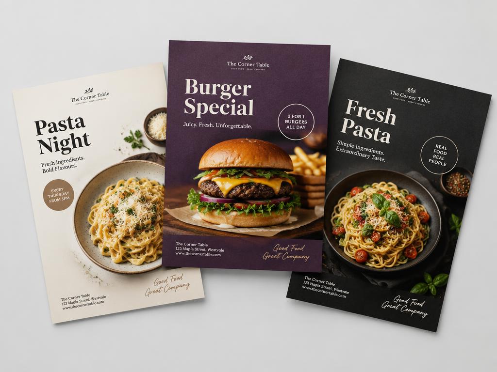
 Bundle price
Canva Templates
Modern Restaurant Poster Pack
₹499₹899
15 editable posters + 10 stories for restaurant promotions.

Website
Concept case studyA dark, appetite-led website for a modern kitchen and bar.
Overview
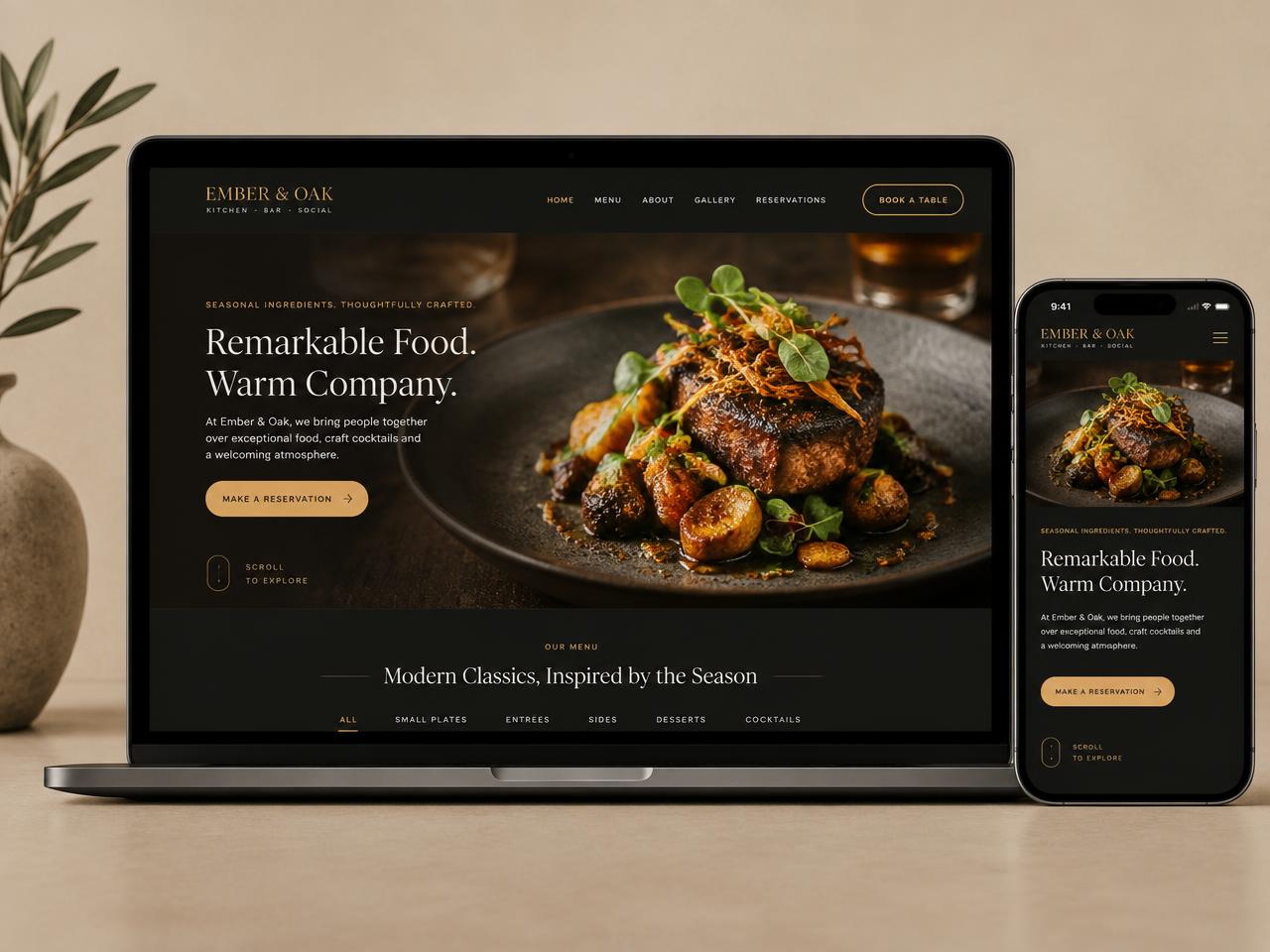
A multi-page restaurant site built around photography and a reservation flow.
Menus were PDFs, reservations went through a third-party link and the brand felt generic online.
Make the food the hero, make the menu readable on a phone, and make booking a table effortless.
Analytics showed 80% mobile traffic arriving at dinner time — the menu and booking had to work one-handed.
Home, menu, about, gallery and reservations. Menu categories became a sticky tab bar on mobile.
Charcoal backgrounds, warm amber accents and a refined serif that echoes the restaurant's printed menu.
Full-bleed dishes, a legible HTML menu and a reservation button that persists across pages.
Mobile-first menu layout with sticky categories and large tap targets.
This is an illustrative concept project. Verified client results are not available, so no performance claims are shown.
Have a similar challenge?
Bundle priceCanva Templates
15 editable posters + 10 stories for restaurant promotions.