
E-commerce Website
Concept case studyLumière Linen Store
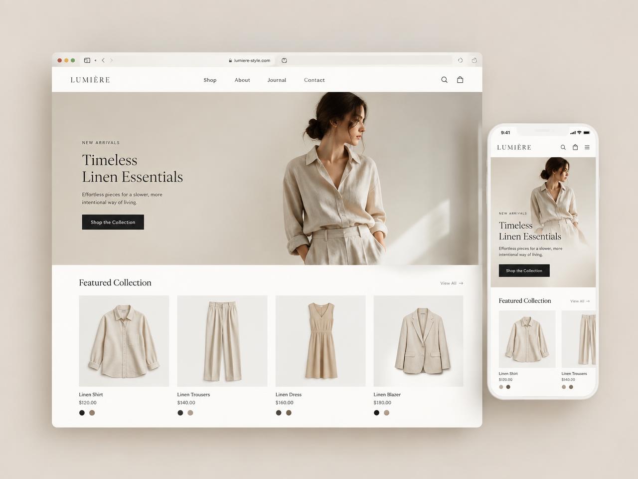
A minimal storefront that lets the product photography breathe.
- Business type
- Fashion retail (demo)
- Year
- 2025
- Services
- E-commerce UX, UI design, Product page system
Overview
A concept storefront for a slow-fashion linen label with a small, considered catalogue.
The problem
Template storefronts crowd the product with badges, banners and upsells.
Objective
Design a shopping experience with the calm of a printed lookbook and the clarity of a good catalogue.
Research & strategy
We studied how customers of small labels browse — fewer filters, more scrolling, strong reliance on photography.
Wireframes
Home, collection, product and cart. The product page leads with a large image column and a fixed purchase panel.
Visual direction
Off-white, sand and black. Thin serif headings, small sans labels, no drop shadows.
Final design
A four-up product grid, restrained colour swatches and a checkout stripped to essentials.
Responsive screens
Two-column product grid on mobile with a sticky add-to-bag bar on product pages.
Design decisions
- No promotional banners above the fold
- Colour swatches instead of variant dropdowns
- Two-step checkout
Results & impact
This is an illustrative concept project. Verified client results are not available, so no performance claims are shown.
Have a similar challenge?
Let’s design the right system for it.
Ready-to-use resources
 Bundle price
Mockups
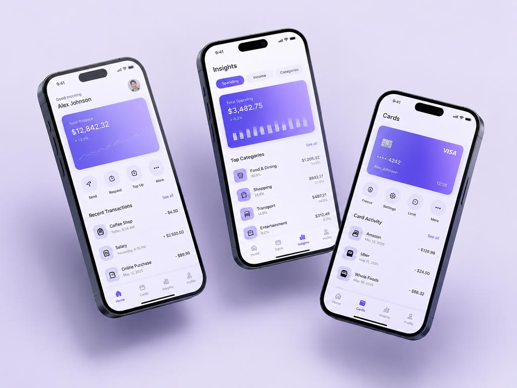
Mobile App Presentation Mockups
₹699₹999
Floating phone scenes for app store shots and case studies.