Graphic Resources
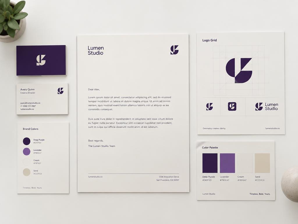
Stationery, logo grids and palette sheets for presenting a brand.

Brand Identity
Concept case studyA quiet Scandinavian identity for a specialty roaster.
Overview
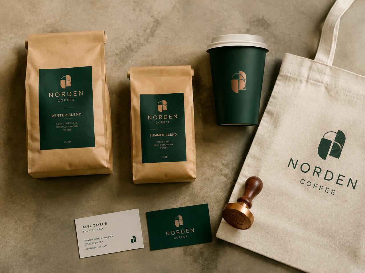
A complete identity system from mark to packaging for a fictional specialty coffee roaster.
The brand needed to feel premium on a shelf full of loud, illustrated coffee bags.
Create a restrained mark and packaging system that reads as considered from two metres away.
Shelf audits of specialty retailers showed that quiet, typographic packaging stood out by contrast.
Logo explorations moved from literal beans to an abstract mark referencing a cup and a northern horizon.
Forest green, kraft and cream with a copper foil detail. Wide-tracked geometric type.
A geometric mark, a typographic lockup and packaging that lets the kraft material speak.
Brand assets prepared for print, social and web with clear-space rules.
This is an illustrative concept project. Verified client results are not available, so no performance claims are shown.
Have a similar challenge?
Graphic Resources
Stationery, logo grids and palette sheets for presenting a brand.