 Bundle price
Figma UI Kits
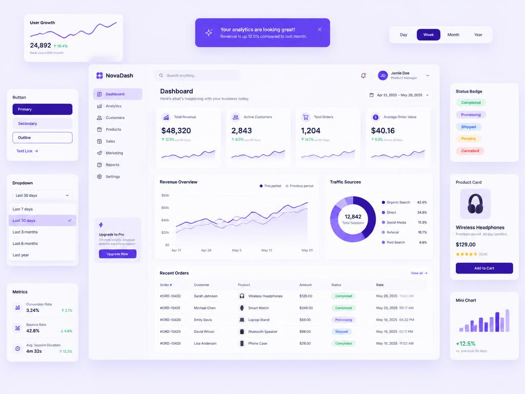
SaaS Dashboard UI Kit
₹1,499₹2,499
Component-based Figma kit for analytics and admin products.

SaaS Dashboard
Concept case studyA calmer analytics dashboard for a growing SaaS team drowning in charts.
Overview
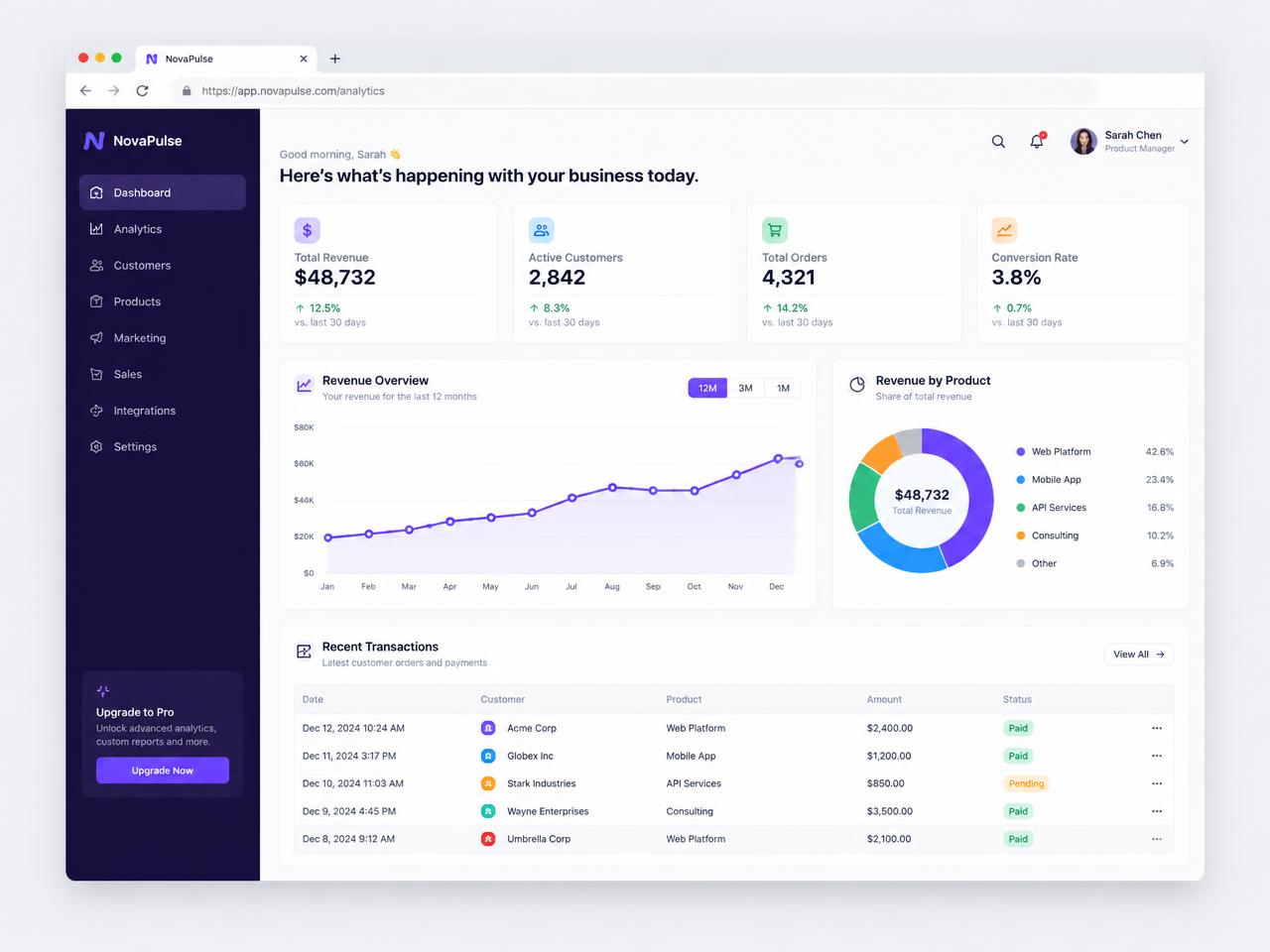
NovaPulse is an illustrative analytics product used to demonstrate how djgraphix approaches dashboard design: hierarchy first, decoration last.
The existing dashboard displayed every metric at equal weight. Users could not tell what changed since yesterday without exporting data.
Design a dashboard where the most important movement is visible in under five seconds and secondary detail is one click away.
We mapped the daily routine of three user types — founder, ops lead and account manager — and ranked the questions each asked most often.
Low-fidelity layouts tested a 'headline metrics + one hero chart' structure against the previous dense grid. The simpler structure won in every walkthrough.
A deep purple navigation rail anchors the interface while content stays white and quiet. Colour is reserved for data and status.
Four KPI cards, a revenue overview, revenue-by-product breakdown and a recent transactions table — nothing else on the default view.
On tablet the rail collapses to icons; on mobile KPI cards stack and the table becomes a card list.
This is an illustrative concept project. Verified client results are not available, so no performance claims are shown.
Have a similar challenge?
Bundle priceFigma UI Kits
Component-based Figma kit for analytics and admin products.