
Branding
Choosing a brand colour system that survives real-world use
A palette is not a brand colour system. Here is how to build one that works on a bag, a button and a billboard.
By djgraphix · 2026-06-30 · 7 min read
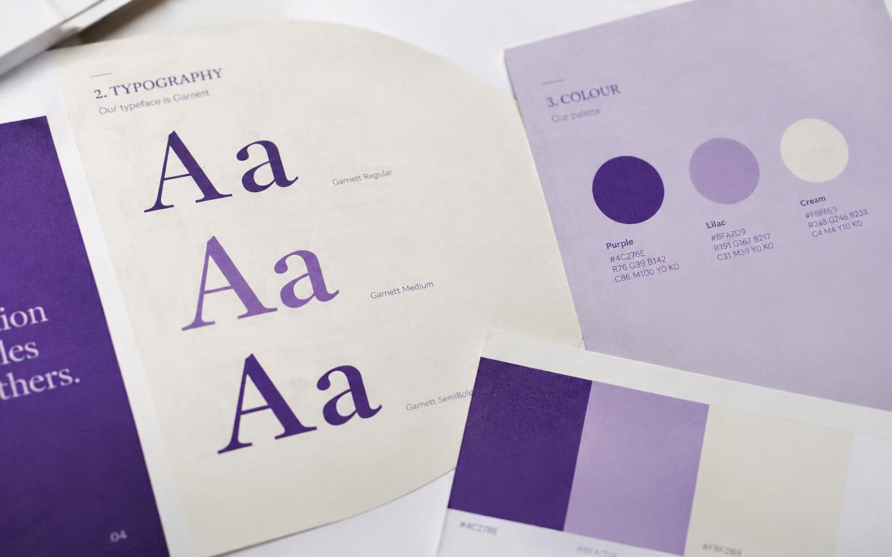
Most brand palettes look wonderful on a slide and fall apart the first time someone needs a disabled button.
One hero, two neutrals, one signal
A primary colour that carries the identity, a light and dark neutral that do the work, and one signal colour for attention. Everything else is a tint.
Test on the worst surface
Print it on kraft paper. Put it on a low-quality screen. If the identity still reads, the system is robust.
Document the rules, not just the swatches
- Where the hero colour may appear
- Minimum contrast for text
- Which colour signals success, error and information