
UI/UX
How to design a SaaS dashboard people actually read
Most dashboards fail because they show everything. Here is the hierarchy we use to decide what earns a place on screen.
By djgraphix · 2026-08-14 · 6 min read
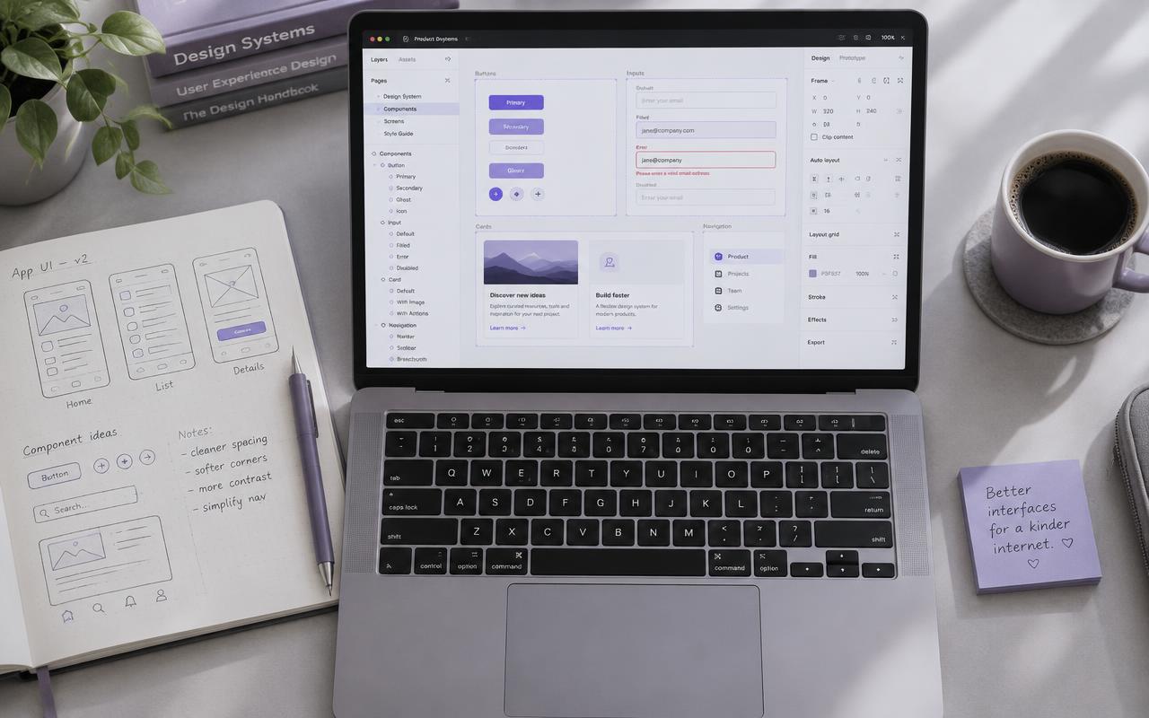
A dashboard is a decision-support tool, not a data warehouse. When every metric is visible, none of them are important.
Start with the daily question
Before opening Figma, write down the one question each user type asks when they log in. Design the default view to answer that question in under five seconds.
Three layers of detail
- Headline metrics: four numbers, maximum.
- One hero chart: the trend that explains the headline.
- Supporting tables: available on scroll or one click away.
Reserve colour for meaning
Use a neutral interface and let colour signal change, status and selection. If your brand purple appears on every card, it stops meaning anything.
Test with the dense version
Put your simplified layout next to the previous dense one and ask users to find yesterday's change. The faster layout is the right one — even when stakeholders prefer 'more information'.